Japan and English Language

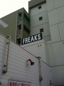
‘Freaks’, I did not want to find out what was there:The image shows a multi-story building with a sign on the roof that reads "FREAKS" in large, bold letters. The building has a modern design with a mix of white and gray exterior walls. There is a red security camera mounted on the side of the building. The lower part of the image includes a sign with Japanese text.
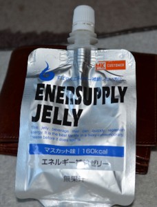
‘This jelly beverage that can quickly replenish energy. It is best for life in a busy contemporary. Please before it does sports.’ How difficult would it be to ask one of the so many English teachers who are in Japan to check the label? The image shows a silver pouch of "Enersupply Jelly," a consumable energy gel product. The pouch has a spout at the top for easy consumption. The packaging includes text in both English and Japanese, indicating that the product is muscat-flavored and contains 160 kcal. The background includes a brown leather item, possibly a wallet or a case.
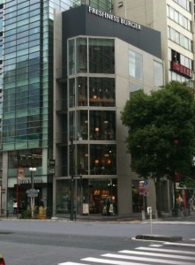
They like to give English names to the stores:The image shows the exterior of a convenience store with a sign that reads "Lawson Store 100." The store has a green and white color scheme. There is another sign on the right side of the image with Japanese characters, indicating another business next to the convenience store. The building appears to be made of brick.
The image shows a multi-story building with a sign at the top that reads "FRESHNESS BURGER." The building has large glass windows on each floor, allowing a view of the interior. It is situated on a street corner in an urban area, with other tall buildings and a tree visible nearby. The street in front of the building has a pedestrian crosswalk.
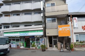
The image shows a street view of a small commercial area. On the left, there is a FamilyMart convenience store with a green and white sign. To the right of the FamilyMart, there is a narrow building with a large orange sign that reads "Caro Hair Design." The buildings have multiple stories, and there is a white truck parked in front of the FamilyMart. The area appears to be clean and well-maintained, with some potted plants and bicycles visible near the entrances.

It says among other things: “We want to show you in as no ‘Customer’ it and ‘Best Friend’.” Did they use Google Translate?The image shows a sign for a hair salon named "Caro hair design." The sign has an orange background with white text. The main text reads "Caro hair design" in large letters. Below that, there is smaller text that is partially readable, mentioning something about "Customer" and "Best friend." The sign is mounted on a building exterior.

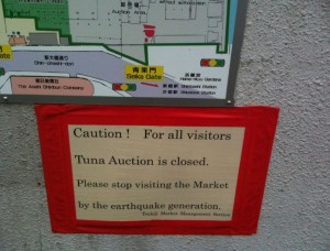
I didn’t really understand what is this ‘by the earthquake generation’.The image shows a sign with a map above it. The sign reads: "Caution! For all visitors Tuna Auction is closed. Please stop visiting the Market by the earthquake generation. Tsukiji Market Management Section." The sign is bordered in red and is posted on a gray wall. The map above the sign appears to be a layout of the market area.
One Comment

Leave a Reply

Your email address will not be published. Required fields are marked *

This site uses Akismet to reduce spam. Learn how your comment data is processed.